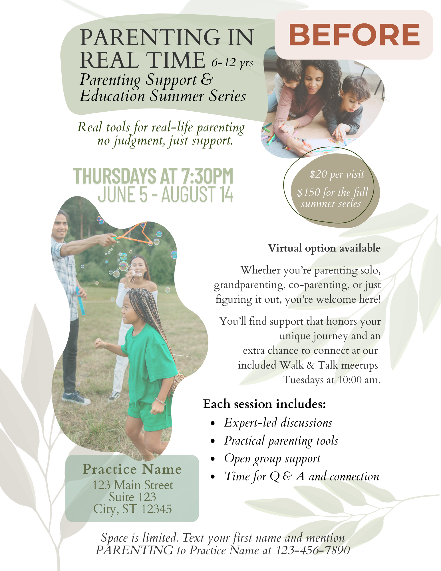
I worked with the client to reorganize the layout and polish the language to help their purpose shine through, while keeping their voice front and center. With their message now clear and easy-to-skim, the flyer spoke directly to the right parents, making it easier for them to see the value and take that next step to sign up.